

2025 Trending Color Palettes for Your New Brand
-
Choosing a color palette is crucial for your brand's perception and success. Natural tones like olive green, terracotta, and sandy beige can convey a calm and trustworthy image. Pair these with off-whites and darker browns for a balanced, readable design. Build your brand up with a well chosen trending color palette to show you are relevant and a powerful business.
Color goes beyond mere visual appeal—it's what can make or brake your brand's identity. For small business owners, non-profits, and modern professionals, the right color palette can set the vibe, stir emotions, and leave a lasting mark on your audience. A well-chosen color scheme can make your brand stand out from the crowd, convey your values, and elevate the customer experience. Even trending color palettes can be a powerful step in showing the world you are here to make your mark.
In this blog post, we're excited to share our top five favorite trending color palettes for contemporary businesses. We'll provide practical tips and real-world examples to help you pick the perfect hues for your brand. Discover how each color impacts perception, the psychology behind color choices, and how to weave these palettes seamlessly into your marketing materials and digital platforms. Whether you're rebranding or starting fresh, this guide will arm you with the insights to make choices that truly resonate with your target audience. Dive in and let your brand's colors shine!

Top 5 trending Color Palettes for Modern Businesses in 2025
With a solid foundation set, let's dive into five trending color palettes for your modern business! We'll showcase detailed examples of each palette and share tips on how to effectively use them within Squarespace. Master these color combinations to elevate your brand's visual appeal and create a cohesive, professional look for your website.
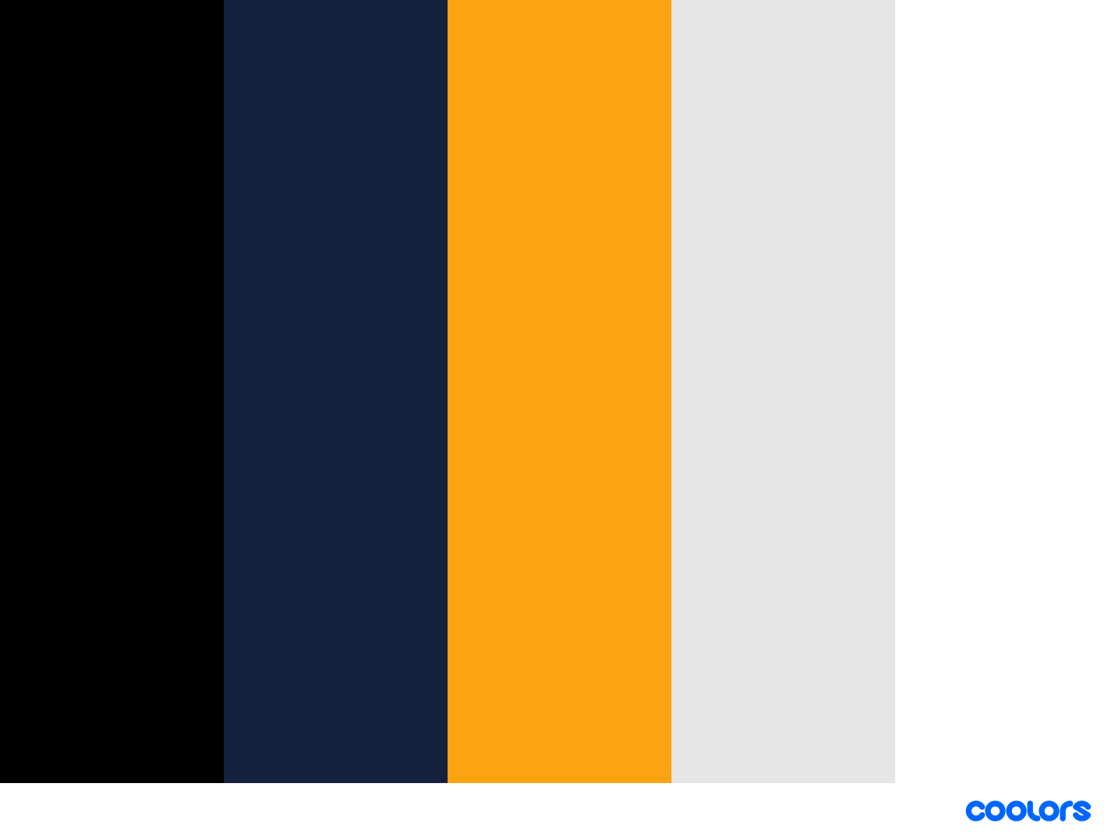
1. Classic Blue and White

This timeless combination exudes professionalism and reliability. Navy blue and royal blue are classic colors that invoke a sense of trustworthiness and stability, making them ideal for businesses wanting to establish trust and authority. These colors are often associated with corporate environments, law firms, and financial institutions.
Application Tip: Use navy blue as your primary color for headers and call-to-action buttons to create a strong visual impact. Royal blue can be used for accents, such as borders or icons, to add a touch of vibrancy while maintaining a cohesive look. Use white as the background to maintain a clean and crisp appearance, ensuring that your content is easy to read and visually appealing. Additionally, consider integrating these colors into your logo and branding materials to create a consistent and professional image across all platforms.
2. Muted Earth Tones

Ideal for brands that emphasize authenticity, sustainability, and a connection to nature, muted earth tones offer a sophisticated and grounded aesthetic. These colors draw inspiration from the natural world, featuring warm browns, soft greens, and gentle beiges. This palette is perfect for eco-friendly brands, artisan products, and any business that wishes to project a calm and trustworthy image.
Application Tip: Use shades like olive green, terracotta, and sandy beige as your primary color scheme. These tones provide a harmonious and organic feel while remaining unobtrusive. Pair them with off-whites or cream colors to maintain a clean and timeless look. Text in darker browns or charcoal greys can ensure readability and create a well-balanced design. Utilize these colors to craft an environment that feels genuine and nurturing, reflecting a strong commitment to sustainability and quality.
3. Bold Yellow and Gray
This vibrant palette captures attention and exudes energy, making it perfect for innovative and forward-thinking brands. The blend of dynamic colors reflects creativity and modernity, ensuring that your brand stands out and remains memorable to your audience.
Application Tip: Use gold for primary actions and highlights to draw the eye to key elements and calls to action. Light yellow can serve as a background, creating a warm and welcoming feel that invites engagement and interaction. Gray adds sophistication and balance, grounding the more vibrant tones and giving the design a polished look. White text ensures readability against the colorful backdrop, maintaining clarity and legibility in all communications. Consider using these colors strategically to enhance user experience and reinforce brand identity.
4. Soft Pastel Hues
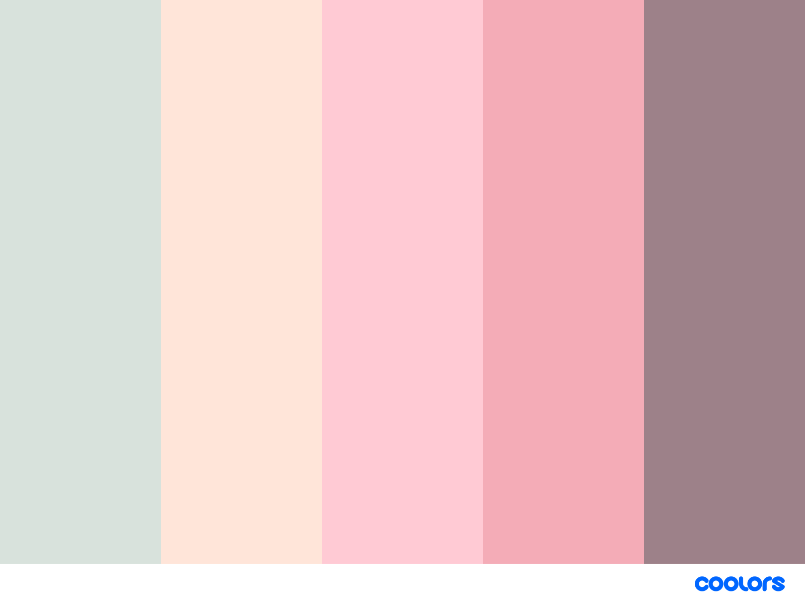
This gentle palette exudes warmth and calm, making it perfect for brands focused on wellness, creativity, and lifestyle. The soft and inviting tones help create an atmosphere of tranquility and positivity, which can resonate well with audiences seeking comfort and inspiration.
Application Tip: Use pastel shades like soft pink, mint green, and baby blue as background colors. These colors can evoke feelings of serenity and relaxation. Complement them with white or light grey text to ensure readability while maintaining a soothing effect. Additionally, consider incorporating subtle gradients and soft transitions to enhance the visual appeal and create a cohesive, inviting design.
5. Trendy Coral and Teal
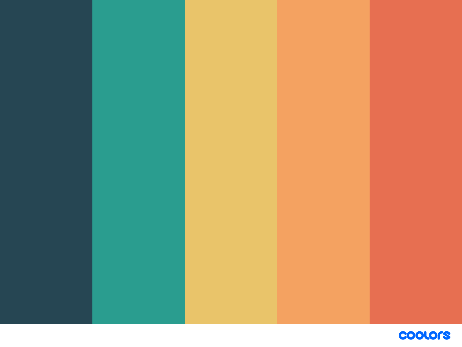
This modern and playful palette is perfect for brands looking to stay current and appeal to a youthful audience. The vibrant and lively colors reflect energy and creativity, making it ideal for companies targeting millennials and Gen Z. This palette can be used across various platforms, from websites to marketing materials, ensuring a cohesive and attractive brand image.
Application Tip: Use coral for primary actions and headers, as its boldness will draw attention and encourage interaction. Light sea green can be used for secondary actions and backgrounds, providing a calming and pleasant contrast. Peach puff adds warmth and a welcoming tone to the design, while white keeps the overall look fresh, clean, and easy to read. Incorporate these colors thoughtfully to create an engaging and visually appealing experience for your audience.
The Importance of a Consistent Color Palette in Branding

Before we jump into our favorite trending color palettes for 2025, let’s talk about why. Maintaining a consistent color palette across all platforms is crucial in strengthening your brand identity. When your audience repeatedly sees the same colors associated with your brand, it creates a sense of familiarity and reliability. This visual consistency helps to build brand recognition, making it easier for customers to identify your brand in a crowded marketplace. Whether it's on your website, social media profiles, packaging, or marketing materials, using a unified color scheme ensures a cohesive and professional appearance. This seamless visual experience not only makes your brand appear more established and trustworthy but also enhances overall brand loyalty. Therefore, carefully selecting and adhering to a consistent color palette can significantly reinforce your brand's presence and make a lasting impression on your audience.
Reflect on Your Brand Values
Your brand's core values and your personality should shine through in your color choices, as they play a crucial role in communicating your message and ethos to your audience. If sustainability is a big deal for you, why not go with trending color palettes that have shades of green? These colors evoke feelings of nature, growth, and eco-friendliness, resonating with an environmentally conscious audience who are likely to appreciate brands that prioritize sustainability. The use of green hues can subtly reinforce your commitment to environmental responsibility and connect deeply with consumers who share these values.
On the other hand, if you're all about innovation, bold and dynamic colors like electric blue or vibrant orange could be the perfect fit. These colors symbolize forward-thinking, creativity, and energy, instantly grabbing attention and conveying a sense of cutting-edge advancement. Incorporating such vibrant colors in your brand can help communicate that you are a leader in innovation, always pushing boundaries and striving for progress.
Moreover, colors like red, known for evoking excitement and urgency, or purple, often associated with luxury and sophistication, can also be considered based on the specific attributes you wish to highlight. Thoughtfully selecting your brand's color palette, tailored to reflect your unique brand values and mission, can significantly enhance your overall brand identity and appeal. It's not just about aesthetics; it's about telling your brand's story and creating an emotional connection with your audience.
Picking the Right Colors for Your Brand
Choosing the right trending color palettes might seem overwhelming, but it can actually be fun and rewarding! The colors you select play a crucial role in conveying your brand’s identity and message. Check out these practical tips to help you pick colors that not only align with your brand's values but also resonate with your target audience, ensuring that your visual representation is both impactful and memorable:
Understand Color Psychology
Colors evoke emotions and shape perceptions, playing a crucial role in how we interpret the world around us. For example:
Blue often signifies trust, professionalism, and calmness. It is frequently used by financial institutions and tech companies to promote a sense of security and reliability.
Red can spark excitement, passion, and urgency. It is a color that grabs attention and is often used in marketing campaigns to create a sense of urgency or to highlight important information.
Green is linked to growth, tranquility, and nature. It is commonly used by brands that promote health, wellness, stress-free processes, and environmental consciousness.
Grasping these associations can guide you in selecting colors that resonate with your brand's message, ensuring that your visual identity aligns with the values and emotions you wish to convey to your audience. By thoughtfully choosing your color palette, you can enhance your brand's impact and connect more deeply with your customers.
Considering Your Target Audience
Demographics greatly influence our color choices! Younger audiences, drawn by the excitement and energy of vibrant and trendy colors, often use these hues to express their individuality and keep up with the latest fashions. Bright reds, electric blues, and neon greens are popular choices among this group, as these colors are associated with youth, enthusiasm, and creativity. On the other hand, professionals and older demographics tend to favor subdued and classic hues, such as navy blue, beige, and charcoal gray, which convey a sense of sophistication, reliability, and timeless elegance. These color preferences reflect their desire for stability and a refined appearance. Understanding these preferences is crucial for marketers and designers aiming to connect with their target audience effectively. By tailoring trending color palettes to the demographic characteristics of their audience, they can enhance engagement and create more impactful visual communications.
Choosing the right trending color palettes for your brand is more than just a design decision—it's a strategic move that can significantly influence your brand's perception and success. By understanding color psychology, considering your target audience, and reflecting on your brand values, you can select a palette that truly represents your brand.
Ready to bring your brand to life with the perfect color palette? Reach out to Elisabeth Hedge today and start the journey of creating a visually stunning and impactful brand. Whether you're rebranding or starting fresh, we're here to help you every step of the way. Contact us now to learn more!