Our 7 Favorite Website Design Trends for 2025
-
Transform your photography website into a client magnet by showcasing your work effectively, optimizing for SEO, and staying updated with web design trends and security. Implement these strategies to increase bookings and take your business to the next level.
Keeping up with website design trends isn't just about looking good — it's crucial for staying relevant and boosting customer engagement in today's competitive landscape. Lately, the focus has shifted towards designs that don't just catch the eye but also enhance user experience, champion inclusivity, and feature stunning color schemes. Let's dive into the latest website design trends that small business owners, web designers, non-profits, and photographers need to know to stay on top of their game.
Mobile-First website Design Strategies
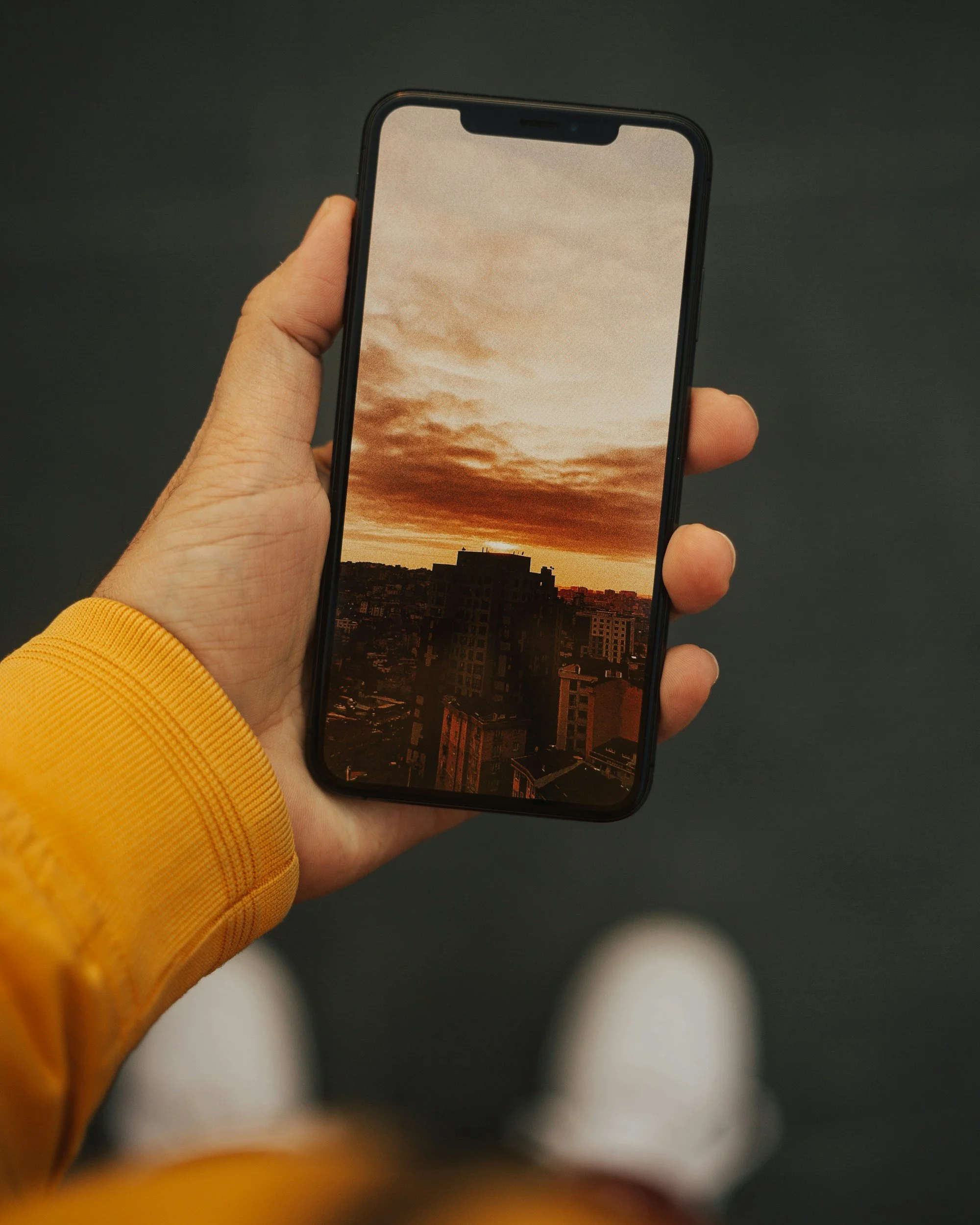
Most of us are glued to our smartphones for browsing, shopping, and checking out content. So, going mobile-first in design isn't just a good idea—it's a must. The trick is to start with designing for mobile and then work your way up to the big screens. It makes sure your site works great and feels right for everyone on the move. Think about using responsive designs, big, easy-to-tap buttons, and simple menus to make everything user-friendly on those smaller screens.
Inclusive website Design and Accessibility
Accessibility is way more than just a trend; it's super important. With inclusive design, we make sure everyone, including folks with disabilities, can get around your website, understand it, and engage with it. Adding stuff like keyboard navigation, making sure screen readers can read your site, and using high-contrast text makes a huge difference for all visitors. Plus, it's just the right thing to do. And hey, making your site more accessible could even get you more visitors and bump up your SEO rankings.
Psst: Did you know that Squarespace is accessibility friendly? It's true! Not just for those using the site, but also for site managers. Learn more about it here.
Personalization in website Design
Personalization is the game changer when it comes to improving user experience and making customers stick around. If you're running a small business, you can use user data to make their browsing experience feel like it's just for them. Show them the stuff they like or offers they can't resist, all based on what they've looked at before. Of course, you've got to be smart about privacy and keeping their data safe, but getting this right can really amp up how much users engage and how often they buy.
Minimalist and Clean website Design
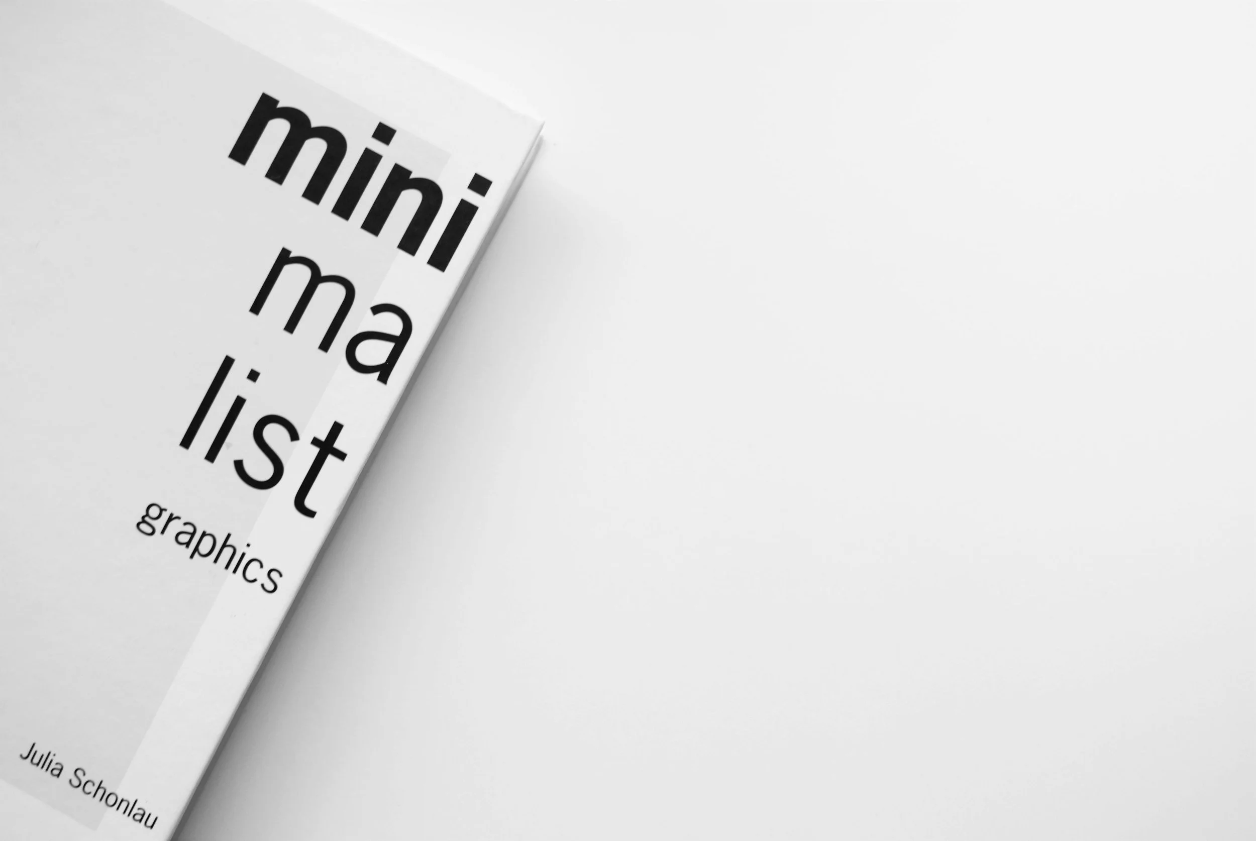
Simplicity is where it's at! Minimalist and clean website design is all the rage now. It's all about the "less is more" vibe—think simple images, lots of white space, and cool, refined colors to give users a sleek, uncluttered experience. Plus, minimalist designs load way faster and help users zero in on what you're saying, boosting engagement.
Dark Mode and Color Schemes
Dark mode is all the rage now, and for good reason! Not only does it look super sleek, but it can also be easier on your eyes and help your phone's battery last longer, especially with those OLED and AMOLED screens. Adding a dark mode to your website isn't just about keeping up with trends; it's a smart move to match what users want and to play around with cool contrasts and eye-catching web design. Plus, getting creative with colors can really make your brand pop and give your site a fresh, attractive look.
Immersive Full-Screen Video Backgrounds
Websites that use big, immersive video backgrounds really grab your attention, don't they? They stand out from the crowd. It's all about drawing you in with these cool videos that not only look great but also tell you what the brand is all about in a super engaging way. Whether they're showing off what a product can do, hitting you in the feels, or explaining what they stand for, these videos can turn a regular website visit into something you'll remember. When done right, this awesome visual trick can make users stick around longer, boost engagement, and just make the whole website look better.
Interactive and Dynamic Elements
Interactive website design with cool animations, scroll-triggered effects, and little micro-interactions really pop! They make the whole browsing experience more fun and engaging because they react to what you're doing in creative ways. Whether it's a little motion that makes a page feel more alive or big effects that change as you scroll, these elements add a whole new vibe. They make the site feel alive. It's like the website is saying, "Hey, come play and discover more!" This not only makes you want to stick around longer but also sets these sites apart from the more traditional, static ones.
Ready to transform your website's user experience with today’s top trends in website design and stand out from the crowd? Don't wait any longer. Schedule a free consultation call 📞 with Elisabeth Hedge today and begin the journey.
Examples of Trendsetting Websites
Immersive
Experience the power of immersive full-screen video backgrounds with GoPro's website, a prime example of how dynamic video content can captivate visitors. GoPro masterfully showcases the thrilling adventures their cameras capture, providing a glimpse into the product’s prowess in capturing the essence of exploration. This not only draws visitors in but also beautifully illustrates the camera's capabilities in action.
Immerse yourself in the exceptional design of Equipe Lawyers which sets a sterling example of utilizing full-screen background to craft a compelling and professional online presence. The moment you land on their homepage, you're met with a captivating visual that convey the firm's dedication to excellence and its dynamic approach to law. This design choice not only captures the visitor's attention but also elevates the user experience by creating an atmosphere of sophistication and trust. The seamless integration of video with the website's overall aesthetic demonstrates the power of Squarespace platforms to deliver beautiful, functional websites that effectively communicate a brand’s core message and values.
Interactive
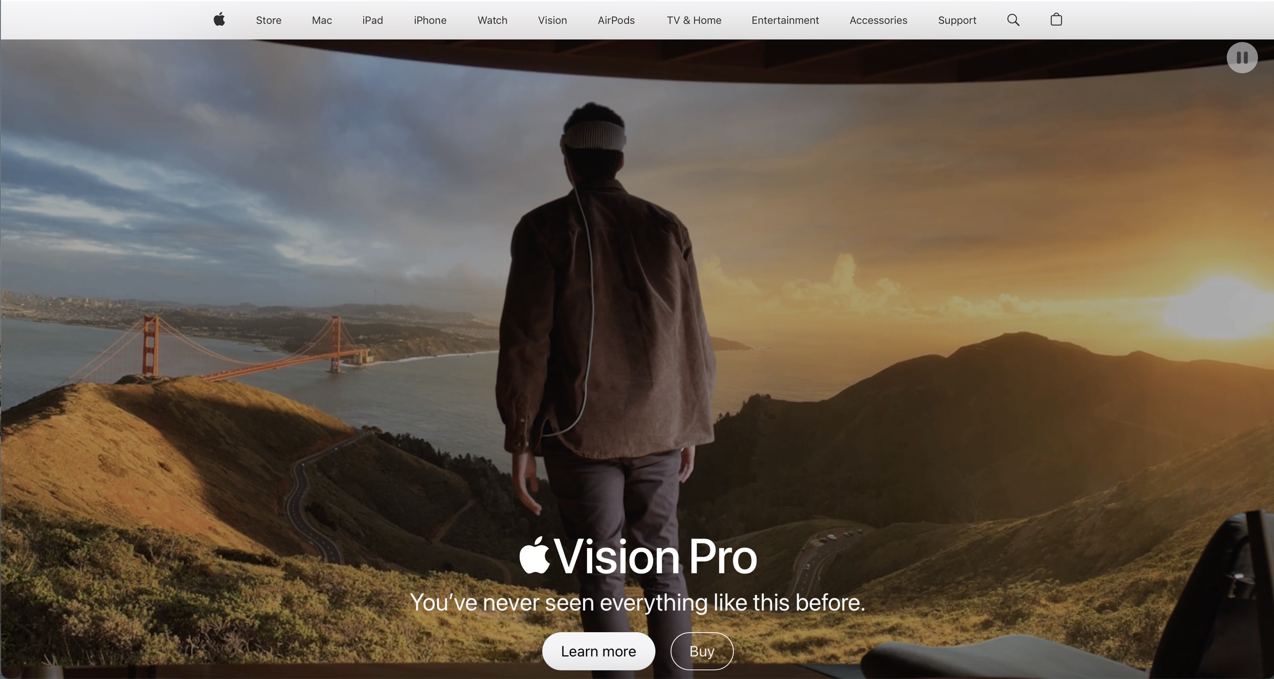
Apple’s website represents the pinnacle of sleek design fused with interactivity, serving as a beacon for those seeking inspiration. Each product, from the latest iPhone to the newest MacBook, is presented in a way that breathes life into hardware through scroll-triggered animations and interactive galleries. This engaging approach highlights Apple’s commitment to not just showcasing products, but creating an immersive experience that brings technology closer to users.
Spotify stands as a testament to the power of personalization in website design, greeting visitors with vibrant animations and micro-interactions that embody the brand’s energetic and user-centric identity. This approach not only sets Spotify apart but also aligns perfectly with the dynamic, ever-evolving nature of music and personal preference.
Minimalist
Airbnb’s approach to minimalism showcases an understanding of the delicate balance between simplicity and functionality. By emphasizing clean lines and ample white space, Airbnb focuses users' attention on what matters most - the high-quality images and descriptions of properties and experiences. The platform’s intuitive navigation and straightforward information presentation underscore a commitment to user-friendly design, proving that sophistication lies in simplicity. Through subtle animations and transitions, Airbnb’s website reflects a dedication to providing a seamless, engaging user experience that speaks to the heart of sophisticated simplicity without drowning users in unnecessary complexity.
Caylon Hackwith sets an outstanding example of minimalistic website design that effectively tells a story. By leveraging a clean and clutter-free aesthetic, the website focuses on the artist's work, allowing the vivid photography to stand front and center. This minimalist approach is not just about the visual aspect; it extends to the user experience, where simplicity in navigation and the absence of overwhelming elements encourage visitors to explore the art in an intimate, distraction-free environment. Each image is framed by generous white space, echoing the feel of an art gallery and inviting viewers to pause and reflect. This design choice ensures that the story told by each photograph reaches the viewer without the interference of excessive design elements. Through this minimalist framework, Caylon Hackwith’s website communicates a powerful narrative of creativity and expression, underscoring the principle that sometimes, less truly is more.
In embodying these principles, our approach to web design is deeply rooted in professionalism, passion, and a solution-oriented mindset, always aiming to elevate our clients’ online presence. We believe in the transformational power of a well-designed website and are dedicated to creating spaces that not only meet but exceed our clients' expectations. Let's collaborate to craft a website that captures the essence of your brand, engages your audience, and propels your business forward. Reach out today to start the journey toward digital excellence.
Ready to improve your website with a trendy website design? Contact us now to begin your journey.


