

9 Emerging Website Trends to Watch for in 2025
-
2024 promises to be thrilling for website trends such as immersive elements, personalized techniques, minimalist layouts, and enhanced mobile experiences. Prepare to elevate your digital presence with these cutting-edge innovations!
Imagine a website that not only looks beautiful and stunning but also attracts your ideal clients to your services. Sounds magical, doesn’t it? In 2025, emerging website trends are popping up quickly, providing small business owners like you with the tools and designs to create a compelling online presence that brings those dream clients in. In this blog post, we will dive into the most exciting website trends for 2024 that you can leverage to make your website stand out. From transition screens to minimalist vintage designs, we’ve got you covered.
Why Keeping Up with Website Trends Matters in 2025
Websites that effectively communicate your brand’s message will stand out, attracting your dream clients like a beacon. Embracing current website trends is a smart move that will communicate to ideal clients you are the perfect fit for them; showing you’re in tune with the latest industry and global developments, and it signaling that your business is modern and vibrant. In 2024, the competition is fierce, but leveraging these website trends will catapult you ahead. Let’s dive into our top 9 website trends that we are seeing transform businesses in 2025.
1. The Magic of Transition Screens
Transition screens are making waves in 2025. These animations or effects that appear between pages can make your website feel more cohesive and engaging. When your visitor clicks on a link, and instead of a jarring page load just like every other website, you can invite them into an experience with a smooth transition that guides them to your home page, about page, and services. This not only enhances user experience but also keeps visitors on your site longer.
What to love about this trend:
Enhanced User Experience: Transition screens can significantly reduce bounce rates by keeping visitors engaged and interested in the content, leading to higher user retention and satisfaction.
Brand Cohesion: Implementing seamless transitions helps align your online presence with your brand’s smooth and professional image, reinforcing brand identity and consistency across all touchpoints.
Visual Appeal: These transitions add an element of surprise and delight, enhancing the overall aesthetic of your site and making it more memorable and enjoyable for users to navigate.
Brand Insights: This dynamic approach empowers you to boldly communicate your brand's values to visitors who haven't explored your about page yet. Rather than merely showcasing your logo, imagine highlighting your brand's purpose, target audience, and vibrant personality right here. This page becomes your powerful impression, setting the stage for an inspiring connection with every website visitor.
Incorporating transition screens can be achieved effortlessly with fade-ins and slide transitions. Platforms like Squarespace provide user-friendly options that require minimal coding, adding an interactive element to your site with ease.
2. Cinemagraphs for Dynamic Effect
Who doesn't like a good Gif? They are fun and brings a playful element to any website that tastefully uses them. Gifs can be used in a variety of contexts, from social media posts to email campaigns, making them a versatile tool for engaging audiences. That's why cinemagraphs (or Gifs) is one of our favorite website trends to watch out for. Creating a mesmerizing effect that will bring your audience in with curiosity, drawing attention to important items on your site will boost your sites unique personality. By blending the static and dynamic, cinemagraphs manage to capture the best of both worlds, providing visual interest without overwhelming the viewer.
What to love about this trend:
Eye-Catching: Cinemagraphs grab attention and keep viewers engaged. Their subtle motion draws the eye naturally, making them excellent for highlighting key information or promotions.
Professionalism: They add a touch of sophistication and modernity to your site. Unlike traditional Gifs, cinemagraphs offer a polished look that can enhance the overall aesthetic of your web pages.
Versatility: Utilize them for headers, backgrounds, or product showcases. For a playful touch, incorporate GIFs to showcase your team's personality in their profiles. It's a fun, creative way to express who you are. You can also use them in blog posts to break up text and add visual interest, or in social media campaigns to create more engaging content.
Incorporating cinemagraphs is straightforward and easy, allowing you to create personalized GIFs for your brand effortlessly. Many online tools and software options are available, making it possible for even those with limited design experience to produce high-quality cinemagraphs. With their blend of stillness and motion, cinemagraphs can elevate your digital content, making it more engaging and memorable for your audience.

3. The Power of White Space
For years, artists and designers have harnessed the design principle of white space, a timeless technique and one that's here to stay. White space, or negative space, is more than merely blank areas on your webpage; it's a powerful design element that significantly enhances readability and user experience. When used effectively, white space can transform a cluttered, overwhelming page into a clean, easily navigable one. As part of modern website trends, utilizing white space effectively can greatly improve your site's design.
What to love about this trend:
Improved Readability: White space helps break up text, making it easier to read by providing visual breathing room. This can be particularly beneficial for readers facing dense blocks of information, allowing them to absorb content at a comfortable pace.
Focus on Content: It allows key elements to stand out, guiding the visitor’s attention to important features like calls to action, headlines, and visuals. This focus can drive user engagement and interaction by highlighting what matters most.
Clean Aesthetic: A well-spaced layout looks modern and professional. Beyond just aesthetics, a clean design can make your site feel more trustworthy and credible to visitors, which can be crucial in establishing a solid online presence.
Our advice? Don’t shy away from white space. It’s a simple yet effective way to make your website feel airy and uncluttered. Tools like Squarespace offer spacing options that allow you to emphasize white space, ensuring your content shines. By intentionally integrating white space into your design, you not only enhance the visual appeal but also create a more user-friendly and engaging experience for your audience.
4. Storytelling Through Impactful Design
At Elisabeth Hedge, storytelling stands as one of our core design principles. It's not just for novels; it's a powerful tool for websites, transforming visitors into a captivated audience. By incorporating storytelling through design elements, you can forge an emotional connection with your audience, making your content more engaging and memorable.
Storytelling on websites involves weaving a narrative using visuals, text, and multimedia. When executed effectively, it can turn a mundane browsing experience into an immersive journey, keeping visitors engaged and hooked.
What to love about this trend:
Engagement: Stories captivate and hold attention better than raw data or plain text. A well-told story pulls readers in, encouraging them to delve deeper into your site.
Relatability: Visitors are more likely to connect with a narrative that resonates with their experiences. This connection fosters a sense of trust and loyalty towards your brand.
Memorability: A good story stays with visitors long after they’ve left your site, increasing the likelihood they’ll return and share your content with others.
Consider using a combination of images, videos, and text to craft a compelling narrative. Be creative and think outside the box to tell your brand’s story in a way that stands out. For instance, you might incorporate customer testimonials that highlight real-life success stories or use infographics to visualize your brand's journey. Personal anecdotes from team members can also add a human touch, making the narrative even more relatable.
Ultimately, the goal is to create a cohesive and engaging story that not only informs but also inspires your audience. By doing so, you'll build a stronger emotional connection and leave a lasting impression.
5. Playful and Bold Design
Don’t be afraid to inject some personality into your website. Bold and playful designs can make your site stand out in a sea of corporate-looking websites. By stepping away from traditional, conservative web designs, you can create a more engaging and memorable experience for your visitors. Personal touches can foster a deeper connection with your audience, making them more likely to return and share your site with others. Don’t underestimate the power of creativity in setting your website apart and leaving a lasting impression.
What to love about this trend:
Unique Identity: Bold designs set your brand apart and make it memorable. When visitors see your site, they should instantly recognize your unique style and identity.
User Interaction: Playful elements can encourage visitors to interact with your site. Whether it’s through animated buttons, interactive graphics, or fun mouse-over effects, these elements can make the user experience more dynamic and enjoyable.
Creativity: It shows that your brand is innovative and not afraid to push boundaries. By showcasing your creativity, you demonstrate to your audience that you’re forward-thinking and willing to explore new ideas.
Experiment with vibrant colors, unique fonts, and interactive elements. Tools like Canva can help you bring your website to life through playful graphics that align with your brand’s identity. Additionally, consider incorporating custom illustrations, and engaging micro-interactions to further enhance the user experience. Remember, the goal is to create a site that not only looks great but also provides an enjoyable and memorable experience for your visitors.
6. The Art of Layering
Another timeless technique used by creatives for generations, layering involves placing multiple elements on top of each other to create depth and interest. This design trend is rapidly gaining traction for its ability to make websites feel more dynamic and engaging by adding visual complexity and richness.
What to love about this trend:
Depth: Layering adds a three-dimensional feel to your site, making it more visually appealing and immersive. By stacking different elements, you can create varying levels of contrast and focus, which can guide the viewer's attention organically.
Focus: It helps to highlight key areas or features on your page. By using layering strategically, you can draw attention to specific calls to action, products, or important information, ensuring they stand out amid other content.
Creativity: Layering allows for more creative freedom in your design. It opens up possibilities for unique compositions and interactions, enabling designers to experiment with textures, colors, and transparency to convey a more compelling narrative.
Try layering images, text, and other elements to create a rich, engaging experience that captivates your audience. Whether it's through subtle overlays, interactive components, or bold graphic placements, layering can significantly enhance the user experience on your website.
7. Organic Design Elements
Organic design is a newer member of website trends that is. It is all about embracing natural shapes and forms. Think flowing lines, soft edges, and asymmetrical layouts that mimic the curves and irregularities found in nature. This trend brings a sense of warmth and approachability to your website, making it more inviting and user-friendly.
What to love about this trend:
Natural Feel: Organic designs make your site feel welcoming and human. The soft, flowing shapes create a relaxed atmosphere that encourages visitors to stay longer and explore more.
Uniqueness: They stand out in a world of rigid, grid-based designs. In an era where many websites look similar, an organic design can set your site apart, making it memorable and distinctive.
Flexibility: Organic elements can be adapted to suit any brand or message. Whether your brand is earthy and eco-friendly or sleek and modern, organic design can be tailored to reflect your identity and communicate your message effectively.
To integrate organic shapes and forms into your design, you can use tools like Canva, which offers a variety of templates and elements that align with this trend. Incorporating these natural elements can give your website a fresh and modern look that resonates with visitors, making it more engaging and visually appealing. Whether you are designing a website for a brand, a personal blog, or an online store, the organic design trend can help create a more connected and authentic experience for your audience.
8. Balanced and Calming Design
Our world is filled with constant noise and visual clutter. You can clearly notice this when driving in town, on the freeway, going into a grocery store, or simply visiting a news website. Creating a design that isn't overstimulating can be a breath of fresh air. Through designs that prioritize simplicity and clarity, ensuring that your message is communicated without overwhelming your audience. A minimalist approach is often the key here, focusing on clean lines, ample white space, and a restrained color palette. This not only helps in reducing visual fatigue but also enhances user experience by making navigation intuitive and content easy to digest.
What to love about this trend:
Enhanced Readability: By eliminating unnecessary elements and distractions, you make the content the star of the show. This ensures that your audience can easily find and consume the information they need without having to sift through clutter. Clear headings, ample white space, and legible fonts all contribute to a more enjoyable reading experience.
Reduced Cognitive Load: A clean, simple design helps visitors process information more quickly and with less effort, making their interaction with your site more pleasant and efficient. When users aren't bombarded with too many visual or textual elements, they can focus better and navigate your site more intuitively.
Professionalism: An uncluttered design exudes professionalism and sophistication, which can instill trust and credibility in your audience. A streamlined look suggests that you care about the user's experience and have invested in creating a polished, high-quality online presence.
Improved User Engagement: With fewer distractions, users are more likely to engage with your content, whether it's reading an article, watching a video, or completing a call to action. A minimalistic design can lead to higher conversion rates and better user retention.
By embracing a simpler, more focused design approach, you can create a serene online environment that captivates and retains visitors without overwhelming their senses. This strategy not only enhances the user experience but also helps in building a strong, positive brand image.
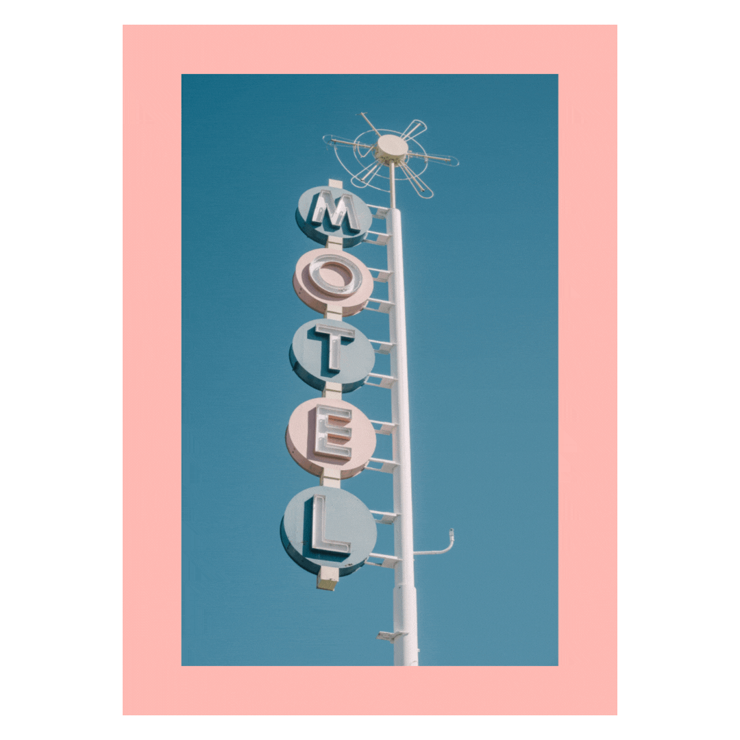
9. Minimal Vintage Aesthetic
The minimal vintage website trends combine clean, modern design with nostalgic elements, creating a unique and stylish aesthetic that is both contemporary and timeless. It’s a great way to forge a look that resonates with a broad audience, bridging the past and present in a harmonious blend. This approach is becoming increasingly popular in website trends.

What to love about this trend:
Timeless Appeal: Vintage elements evoke a sense of nostalgia and reliability, reminding us of simpler times while still fitting seamlessly into today's advanced digital landscape.
Simplicity: Minimal design ensures your site remains clean and user-friendly, making it easy for visitors to navigate and find what they're looking for without overwhelming them with too much information.
Versatility: This aesthetic can be adapted to various industries and brands, offering flexibility whether you're in fashion, tech, or any other field. Its broad appeal ensures that it can be customized to fit the unique voice and identity of any brand.
To achieve this look, consider using vintage fonts, muted color palettes, and simple layouts. These elements work together to create a cohesive and sophisticated design. Platforms like Squarespace offer a variety of templates that make it easy to incorporate a minimal vintage aesthetic into your website effortlessly. These templates are designed with both form and function in mind, ensuring that your site looks beautiful while maintaining optimal performance.
Overall, the minimal vintage trend is a powerful tool for anyone looking to create a visually appealing and engaging online presence. By blending modern simplicity with nostalgic charm, you can craft a timeless look that stands out in a crowded digital marketplace.
10. The Y2K Comeback!
The Y2K trend is making a bold comeback in 2025, tapping into nostalgia for the late '90s and early 2000s while blending it with a modern edge. Known for its vibrant, tech-inspired aesthetics and futuristic optimism, this style is characterized by metallic finishes, neon hues, pixelated graphics, and playful, retro elements. It’s a celebration of an era that was both digital and daring, reinterpreted for today’s design landscape.
What I Love the Y2K Trend:

Vibrant Aesthetics – The bright colors, shiny textures, and bold patterns of Y2K design instantly grab attention and create an energetic, fun visual tone.
Playful Elements – With quirky animations, funky gradients, and nostalgic icons (think pixel cursors or vintage buttons), Y2K design doesn’t take itself too seriously, adding a sense of playfulness.
Retro-Futuristic Vibe – Y2K captures the blend of an optimistic future imagined through the lens of early internet culture, offering a unique mix of nostalgia and forward-thinking style.
To bring the Y2K trend to life on your website, focus on bold, metallic, and neon color palettes to set the tone. Incorporate pixelated or glitch-inspired graphics to tap into the retro digital vibe. Playful, unconventional typography—such as bubble letters or futuristic fonts—can further create that throwback feel. Add subtle animations or interactive elements, such as digital rain or pulsating buttons, to deliver an engaging, era-inspired experience. This trend works especially well for brands that aim to connect with younger audiences or want to evoke a fun, tech-forward identity.
Keeping up with website trends is helpful for maintaining a modern, engaging, and effective online presence. Whether it’s through transition screens, cinemagraphs, or organic design elements, these website trends can help your brand stand out in 2025 and beyond. With these tips and the right tools, you’re well on your way to creating a website that’s not just beautiful but also highly functional and engaging. Let's make 2025 the year your website truly shines.
Ready to revamp your site? Start with a Squarespace Refresh Today and watch your online presence transform into a powerhouse that propels your business forward.